
This project was a collaboration between Brad Simpson, Todd Vanderlin and myself. We began the project seven days ago when we learned of the competition and developed it from initial ideas to the final foldable posters within the week. Below is a brief description of the process of parsing, sorting, visualizing, and composing the final posters.
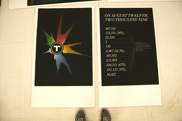
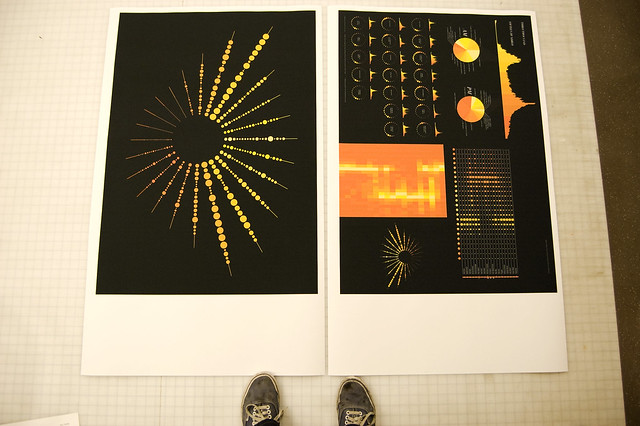
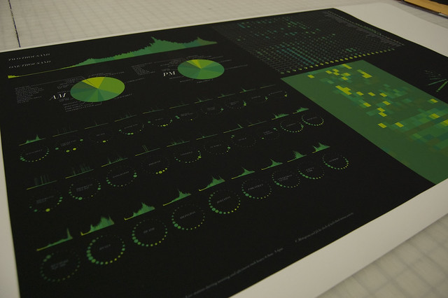
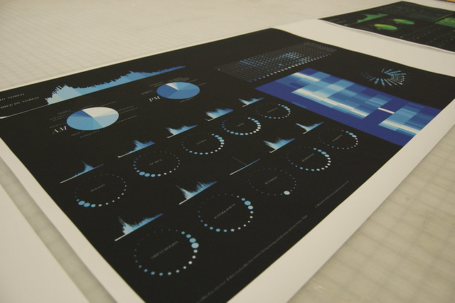
The subway data from August 12, 2009 was parsed in openFrameworks and Matlab using custom applications. Statistical analysis was performed in Matlab for subway loading (temporal and geographical including the entire MBTA, individual lines and individual stations), rate of subway activity and associated data. openFrameworks was used to generate the central visualizations for the project. Programs were written to interpret data that was processed into several arrangements to emphasize different trends within the data. Linear charts were used to display the activity of stations on a given line to show the geographic relation of activity throughout the course of the day. Circular 24-hour clocks for individual lines and stations were made in order to see the relative activity throughout the day. Pie charts were used to visualize rush hour commutes on each line, showing the contrast of activity during morning and evening rush hours. Histograms were used to show the breakdown of daily activity in a linear fashion. Layouts were done in Illustrator and visualizations were combined in order to create the five individual MBTA line posters and overall MBTA poster. Individual print posters are 33in x 23 in.
Links:
infosthetics